Sunday, February 24, 2013

The Fate of my Swirlydoos Journey.... (Shabby Altered Jewelry Box, Just Because Mixed Media Canvas, Art Journal)

Hi!

So I am very far behind in posting my Swirlydoos Ultimate Design Competition entries.... I swore when I started this blog I wouldn't fall behind, and here I am.... behind!  But no worries, I am about to catch up....

I left off with my Week #2 entry....  the Swirlydoos UDC is a contest sposored by Swirlydoos Kit Club to find their ultimate designer... lots of prizes and a possible spot on their design team.  The challenge is set up as a six week contest with a different challenge criteria each week.  So far, I had made it through week #2....

Week #3's challenge was a fun one... make a project using metal tape or metal sheets... metal tape can be found in your local hardware store and is inexpensive.  It looks like duck tape on a roll, and has a peel off adhesive backing.  I had never used it before, and after watching the tutorial design team at Swirlydoos provided (on YouTube.com, by the talented Miranda Edney) I thought this challenge would be lots of fun...it was, but I sure struggled with it!  I decided to do an altered project....


I used a plain wooden jewel box with drawers from Michael's and painted the whole
box white.  Then I decoupaged my various printed papers onto the outside of it.  Then I took the knows off of the drawers and cut my metal tape to size.  Run the pieces through your embossing machine, color with some Tim Holtz alcohol ink, rub with some with gesso, and "voila", such a cute box!  I made the flower arrangement on top by making some embossed metal tape flowers mixed in with regular paper flowers.  I threw in a little metal butterfly, a cute frame, a small Tim Holtz bottle, attached some pearl flourishes to the front and sides, and my project was done... and it was good enough to get me to week #4 in the challenge!
 
Week #4 was particularly fun for me... I really enjoy being a "dirty girl"... that is, being up to my elbows in ink, paint, paste and any other sort of art medium you can think of.  The topic was to do a mixed media canvas in which we were to create a background, and use modeling paste, gel beads and/or other art mediums (Swirlydoos Imagination Lab, Part 1) (Swirlydoos Imagination Lab, Part 2).  I went crazy with this one.... it was definitely my favorite challenge of all!


This canvas was one of my favorite picture I ever took of my beautiful son, Miles.  I printed
a lovely quote called "Just Because..." directly on the picture, which is printed on canvas, and I included another quote in the bottom right that reads, "Disability is the inability to see ability..."
I just love that!  And so, my journey with the Swirlydoos UDC continued to Week #5....
 
The Week #5 challenge was something new for.... Art Journaling.  I have seen many examples
art journals, and I was excited to try one myself.  I looked at many more examples, and even looked up the definition, to make sure I knew exactly what was expected of me...


"a notebook kept by an artist as a personal record of images
and sometimes words; also called artist's journal"
 
I thought this was right up my alley..  I watched to tutorial video (this time a very short video
at the Swirlydoos site) and eagerly jumped into my task...


I was really happy with my pages, and I included every thing that was on the list to create... paper layering using only scraps from other projects, clustering, creating a background,  a spot for journaling (I just did my journaling, instead of leaving a blank space...), doodling, and various art mediums such as misting, paste etc. ...  it was at this week that my journey in the quest for Swirlydoos UDC came to a close... I was voted off!  Very disappointiing to be sure, but not my last shot at finding a design team to work with!
 
I know this was a really long post, but I just wanted to share my journey with
Swirlydoos with you!
I hope you enjoyed my projects!
 
 
                                     Shelley


Wednesday, February 6, 2013

"Lovely" Layout (UDC #2) and Scrap Retreat!

     Hi!  It's been an eventful couple of weeks for me, not the least of which my son was ill, my mother-in-law has been in and out of the hospital since before Christmas, and then I was sick with the same thing my son had.  But in the midst of all of that, I am still in the running with the Swirlydoos Ultimate Design Challenge, and I am so happy for that!
     I have been attending a scrap retreat in my area (Scraptacular Getaways) and had three days and nights of scrapping bliss... it was in beautiful Napa Valley, California, and it really was a getaway for me.  No husband, no child, no pets, and no distractions!  I was tons of fun!
     I was pretty productive while I was there... Swirlydoos had issued their next challenge in their UDC contest, and I had made it to week #2 (only 4 more to go!).  The challenge for the week was to create a project with lots of layers, paper and otherwise.  So, that was the first project I tackled
 at the retreat.
 
 
This is my very beautiful niece, Jessika.  I wanted to do a layout that was reminiscent of
old Hollywood glam... I had this paper from Webster's Pages (Hollywood Vogue), and thought it was perfect... plus, one of the papers is in purple tones, which is Jessika's favorite color!
 
I started the layout by distressing my base paper, and all the layers I wanted to use...there are 4 base layers in all, each about a 1/2 inch smaller then the one below it.  Then, I distressed and matted each of the pictures I used.  Notice on the upper left picture, I used two different sized of the same picture layered over each other.  This helps to bring the photo "up" and make it more of a focus picture.  Then I tore some old bridal hat netting I found at a thrift store, placed it on my page, and mounted my pictures on top of it.

 
The netting adds a vintage Hollywood touch, huh? Lots of fun!
After the pics were mounted (here's a hint... I used one stripe of glue down the center of the mats and photos so I can tuck things under them when I am embellishing) I started tucking in bits and pieces of things I fussy cut from the papers.. when I had an arrangement I likes, I started gluing them down.


A gray rhinestone and pearl flourish sets it all off, and adds another touch of glam.
 
For the flowers, I used a feather and pearl piece I found in the mask making section at Michael's. I cut it in half, and mounted it toward the bottom left corner of the layout, and them placed my flowers over it.  The diamond border was fussy cut from one of the papers, mounted and then I used some rhinestone embellishments by Recollections (Michael's) for some more blingage.

 
Here's a closeup of the torn edges of the bottom layers.. after I had everything laid out and glued down, I went back around the whole layout tearing and crumpling up the edges of pieces until I was happy with it.
 
I was really happy with this layout, and apprantly the Swirlydoos design team was too, because I
was able to progress to week #3...
 
I made two other layouts at the retreat, and I will post those tomorrow!  Hope you enjoy this one!
 
 
                                     Shelley
 

Monday, January 21, 2013

In His Hands.... (Swirlydoos Ultimate Design Challenge- Week #1)

Howdy!
 
I hope all of you had a wonderful New Year's celebration.... are you all keeping up with your resolutions? LOL!
 
After several week off from scrapping, I got an email telling me about a new challenge... I am currently a member of the Swirlydoos Kit Club, and they started the new year with a fantastic contest... they are calling it the Ultimate Design Challenge, and Wowzers!... great prizes, and lots of inspiration!
 
 
Anyway, one of the prizes might be a spot on the Swirlydoos Design Team, so I decided to
enter... of course, the $400.00 prize package doesn't hurt either!
 
The first challenge was to create a layered embellishment to be used on a layout, card or altered item,
using chipboard or paper as the base, and at least two art mediums such as gesso, paint, inks, crackle
paste, etc.  We had a deadline of a little less than a week, and boy!! There were some really beautiful
entries!  So inspiring!
 
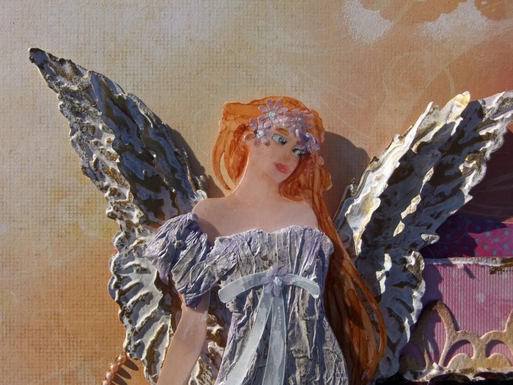
Here is my embellishment:
 

I used metal and diecut the angel wings with Tim Holtz's layered angel wings die, and embossed them with the matching embossing folder.  Then I used gesso (can be found in the paint section of your local art store or Michael's... it is primarily a primer, but has a nice matte look to it...), and gold leaf Rub N' Buff (also sold at Michael's... it's in a little tube where the metal leafing items are... you apply LIGHTLY with a sponge or your finger and rub...), and kept layering the two mediums until I had what I liked.  Then I assembled the wings with adhesive, and slightly bent the wings up.
 
 
For the angel, I used the Cricut Art Noveau cartridge, and cut the angel out at 6 1/2 inches tall... the body and hair are two layers of peach vellum, and the dress I cut out of Tim Holtz grungeboard... I gesso'd the grungeboard and then I used mod podge decoupage glue to glue on lavender tissue paper,
crinkling it into folds to resemble fabric as I went. When it was dry, I tore the excess edges of the tisuue paper off and I started the layering process again with the gesso and Rub n Buff... if you try this, use a LIGHT hand!! It is easier to add mediums than to take them away!
 
 
I layered the body together, and glued them in spots where the dress would cover the glued areas... I did NOT glue the face pieces together, since the glue would show through the vellum.
 
To make the hair, I carefully drew around the hairline with a Copic marker in a light color, and then colored in the rest of the hair.  Then I took a medium and also a darker color and drew in the tendrils... one thing about using alcohol inks on vellum is that you have a longer working time than with regular inks... you can "push" the color around on vellum.  When working with these pens, always start with the lighter color, and add the shading progressively, light to dark.  I also did some shading to define the jawline and neck with a medium fleshtone color.  Be careful to let the inks dry before moving on, or you run the risk of getting the ink on parts of the face where you don't want it! (if this happens, though, you can use a clear blender to get most of it off...)
 
 
I drew in the features by hand (the diecut has the eyebrows and eyeholes already cut out, which makes placement so much easier!)  Using a bit of gesso and a toothpick, I colored the eyes white, and then added blue and a very small black pupil... since she is facing to the left, I made her iris going that direction... for the mouth, I used a rose colored watercolor pencil, and basically drew a triangle first, with the larger side going off to the left... then I filled it in and drew a top and bottom lip from there...  Faces can be very difficult, so if you have never done one before, there are many tutorials on YouTube.com and practice makes perfect!! Don't get discouraged.. just keep practicing! (I have drawn probably hundreds of faces for various crafts, and a lot of doodling!!)
Once you have a face you like, adhere the vellum body to the dress, and punch out some very small vellum flowers... glue those very carefully along the hairline to keep the face piece from popping up, and dot with gesso.  Then I used white pearl lumiere on the flowers, and a little on the face for an ethereal look.  I also cut the ribbon for the dress from light blue vellum and adhered it to the dress with just one spot of glue under the flower... use another little flower in the center to hide your glue, and dot it with gesso for the flower center.  I used pop up dots to adhere the angel to the wings...
Whew!! A lot of work, but a stunning result, I think!
 
So after all that, I still needed to make a layout, so I chose a picture of a very special little girl....
 
 
This is my niece, Emily, that passed away when she was only 4 months old... I never got to meet her, since my husband, son and I were stationed out of state with the military, but she would have been less than a year younger than my son if she had lived.  Her mom and dad, my sister and brother in law, have always kept her in their hearts and minds, and made sure their other children remember her.  Such a beautiful little girl, and while she is missed greatly on this earth, we know she is safe in God's hands....
 
For this layout, I used papers from Prima's Firefly collection, flowers from Prima, pearl flourishes from Want2Scrap, and gold doilies and a laser cut wood cross from Michael's that I painted with robin's egg blue acrylic paint and then used Rub n Buff on.  I also used the doily as a stencil lightly around the edges of the layout...


I hope you enjoy this layout... while the subject matter could be viewed as sad, I take joy in knowing this sweet baby is safe and loved, and I wanted to make a fitting tribute to her and her family.  I used joyful colors in this layout.. I really love it!
 
I guess I might label this post as a mini tutorial...  if any of you happen to use any of these tips to make your own paper piecing, I would love to see it!!
 
And, by the way, I made it to the second week of the competition... yay!!
 
Have a great day, and happy scrappin'!
 
 
                                 Shelley


Wednesday, January 9, 2013

New Year, New Ideas...

Happy New Year!

     As much fun as the holidays are, I must admit to being a little bit happy when they are over...  I love all the food, family and celebrating, but in the midst of all the hoopla, I often long for just a quiet moment to be by myself, read a book, or do some crafting.
     We did have a good Christmas this year... my DH Ed, our son Miles and I traveled to visit family in Southern California, and we managed to see most of our southern relatives.  We even went to Disneyland!


Such a bunch of bright shining faces!! We really had a good time!
 
Since I have been home again, I have been having a little bit of a hard time getting back to
papercrafting, so I decided I would do a little beading instead... my favorite thing to
bead is Christmas ornaments for my family, and I used to make a new one every year for them. 
I haven't in the last couple of years because I was focusing on other crafts, but after seeing
my stepmom having the ones I had made for her on display, I was inspired to make one!
It felt really good to do some beadwork!
 
 
            I LOVE how it turned out!  This was a pattern by a very talented lady named
 Deb Moffett-Hall (patternstobead.com) and it was fun and very calming to work on
 after all the frantic-ness of the holiday season.
 
I have some big plans for my crafting, and for my blog this year- I am really planning
on entering as many challenges and competitions as I can, and applying to as many design teams
as I can as well.  Also, I look forward to making some tutorials to post here on my blog of my
own favorite techniques and ideas.  I hope you will join me!
 
I hope all of you had a great holiday season, and are looking forward to whatever this
year has in store...  may 2013 be a great year in your life, and ESPECIALLY in your
crafting!
 
                     Shelley


Sunday, November 25, 2012

Tough Guy, Gentle Heart....

   Hi, and hoping you are having a great day!

Posting two days in a row, I must be on a roll.... but I finished another lovely layout last night, and just had to share it!
 
My brother is the subject of this layout.... he is a rough and tough kinda guy, but has
a really gentle, loving side... I decided to try and show both sides by making a background paper that looks kind of graffiti or grungy, and then have the floral touches... of course, the photo itself sorta tells the story anyway, with my tough brother standing in a field of flowers!  I'll bet he was messing around and doing "catalog posing" for this pic! 
 
"My brother Billy and I live in different worlds- he is an audio engineer and music producer in the alternative music world, and has a totally different lifestyle than my "white bread" existence. He works hard, lives hard and plays hard. But beneath the many tattoos and body piercings lies a gentle soul that loves children, pets and his family more than anything. He will alsays play with his nieces and nephews, and they all LOVE their Uncle Billy! He is also very sentimental, and loves anything with historical or significant meaning to his own life or someone else's. Even though I have known him his whole life, he still manages to surprise me with his tough exterior, and gentler inner man."


I have been experimenting with a lot of different techniques lately, and my favorite new
medium is Faber-Castell's gelatos.  They are stick paints that look like a little Chapstick, and you color with them like a crayon.... spritz them with some color mist or water, and VOILA!  you have some really cool effects on your project...  I used white paper with purple, yellow, gold and two shades of green.  I just spritzed my paper lightly, because I wanted the crayon strokes to show instead of everything blending together.
 
I also used an emboss- resist technique... if you have never tried it, it is a lot of fun!
I used embossing ink and stamped my image BEFORE applying the gelatos, and embossed the image with UTEE (ultra thick embossing enamel).  I stamped and embossed once, and after the image was cool, overstamped and embossed it again... the overstamping makes the image really thick and textured, so it will stand out well when you apply the gelatos.
 
I premarked on my paper where my picture was going to go, and then used the same
emboss-resist technique for the first part of my title.
 
Here is another neat use for UTEE...  I took a precut chipboard bracket, and inked it
with white ink (Clearsnap mixed media ink).  When it was dry, I stamped "gentle heart" on the bracket, and dried it with a heat gun.  Then I stamped the whole bracket with embossing ink, and covered it with UTEE... use your heat gun to melt it, and it makes another great textured element for your page!
 
The squares background paper I got from the Color, Stories, Inspiration site for their Case File
No.46 Challenge... this layout was my entry for this week, and I used the sketch from Once Upon a Sketch for the month of November.... I am also entering this layout in that challenge... Here is the sketch and the case file:
 
For the evidence in the CSI challenge, I did a grid design (the background squares paper), painting, textured element, and something that shimmers or glows (I used glimmer mist on the gelatos)... for the testimony, I did something that surprises me, and the inspiration word "surprise".

For some of the background flowers, I used the squares paper and punched out some
flower shapes, spritzed them with water, and crumpled them up... when they were dry, I smoothed them out a little... not totally, and lightly rubbed them with shimmery paint.  Then layer them, and you have another element to put on your layout!
 
I have really enjoyed playing along with CSI and OUAS this week.... I hope you visit their sites
also get inspired!
 
                                   Shelley


Friday, November 23, 2012

A Love Story.... new layout!

     So, I apologize for not posting sooner, but with our holiday of Thanksgiving, time just got away from me!  What a heck of a crazy week!
      I recently joined an awesome kit club at http://www.swirlydoos.com, which has the most BEAUTIFUL kits for someone like me who likes vintage/shabby/technique driven type scrapbooking... they also have a monthly challenge based on using their product kits and a sketch.  Luckily, the colors in this month's kit matched up to this week's CSI color challenge, so I made my layout and submitted it to both sites.  Two birds with one stone!
Here is the sketch provided by Swirlydoos.....
 
...and here is the case file for CSI....
 
And here is my layout!  I must say.... I love, love, LOVE how it turned out... one of my
faves of all time.... I want to first point out the large circle behind the photo... one
of the cool things about the Swirlydoo site is that they have a ton of tutorials...  flower making,
new techniques and many more.  There is also a technique add-on for the monthly kits that features
new items every month, and there are technique tutorials to show you how to use them... even
though I did not order the technique kit, I did check out the tutorials, and found one by Lynne Forsythe that was AAHHH-MAZZZ-ING!  She showed how to use gelato sticks on corrugated cardboard to create a really shabby, distressed look... I just purchased some gelatos and decided to give it a try.... I LOVE how it turned out- it really gave some cool texture to my layout!
Here is a link to her tutorial:
 
Check it out!  Thanks Lynne!
 
Anyway, I employed a lot of really cool techniques on this layout in addition to Lynne's
technique...  I started by writing the story of my grandparents romance that I wanted to tell... it reads:
 
"On a fine spring day in 1937 Ohio, a young man named Bill decided to skip out on his high school graduation and hop on a train bound for California. After arriving and settling in, he started frequenting a drive in, where he spotted a lovely red headed young lady by the name of Ruby.
At first Ruby denied his advances, since she was dating someone else. But in the end, Bill won out, and they were married after only 4 months.
Their life together was not all roses and romance... they had financial and emotional struggles... they were seperated by World War 2... they endured happiness and heartache. But in the end, their love for each other persevered, and they were married for 61 years before Bill died. His last words were to Ruby, declaring his love.
They were my grandparents, and I am truly touched by their true love story."
 
I wanted a handwritten look, so I chose a font that I liked, and printed the journaling onto
a transparency.  Then I distressed and inked all the edges of all the papers I was using as
 well as the photo...
See how pretty the journaling looks... almost like a book page!
I used the chipboard frame from Dusty Attic in my kit as the round element from the sketch,
and embossed it with Stampendous Shabby Embossing Enamel in Shabby Green...
these are my new favorite embossing powders!  Anyway, then I did some slight inking over the embossing, just to tie in the colors...
 
The hands of the clock are by Tim Holtz, and I used a small pearl bead in the center.
 
Here is another view of the corrugated cardboard "done up" with gelatos... I also used a white
paint dauber on it as well as on the edges of the papers, photo and flourishes... the flourishes are
a Tim Holtz Sizzix Bigz die...
Did you notice the little pearl stickpin? That also came in my Swirlydoos kit!
There is a lot of detail on this layout... I used a little metal plaque covered with cardstock
that I wrote the date the picture was taken on....
 
Here is another interesting detail... doilies! Yup... the paper kind used in bakers everywhere...
they are cheap, pretty, and you can spritz them in all sorts of colors... I used Tattered Angels mist in Taupe for this one...  the rub on (LOVE) is Kaisercraft, from their Periwinkle collection.  It is on a piece of shaped chipboard that I covered with patterned paper.
 
Some more subtle details... a wooden tag (Prima Craftsman collection), and vintage pearl
heart button, and a round button I made myself.... Martha Stewart makes some
really cool molds for clay (you can get them at Michael's), and polymer clay (found at most craft stores...) is super easy to use...  just soften it up a little in your hands, press it into the mold, pop it out, and bake it in a 275 degree oven for about 15 minutes.  It will seem soft when you pull it out, but it will harden up as it cools.  I have used this technique for other things (like jewelry making) and you can paint the polymer, use perfect pearls on it, ink, or whatever you like... it is very versatile stuff!
 
The flowers that came in my kit were a bit too blue for the rest of my layout, so I gave
them a little Tattered Angels mist bath (Taupe).  I also used plain white paper roses that I spritzed with TA mist as well, and added a little white paint dauber to.  The final touch was another wood piece from the Prima Craftsman collection.
 
Whew!  This is quite a layout! But ever so much fun....I am really proud of it!  I also
have some more flair.... it is on the "Watch List" for CSI this week... way cool!
 
     So for those of you celebrating Thanksgiving, I hope it was a good one, full of good food, family and fun.... we all should be so thankful for ALL the blessings in our lives EVERY day...
 
Bless you all, my crafty friends, and I will see you next week!
 
 
                                 Shelley
     

Wednesday, November 14, 2012

Star Witness for CSI!

Hi everyone... Hope you are all having a very fine day!
     I just wanted to post that my latest layout, "Miles Fan Letter" was chosen as Star Witness for this week with Color... Stories... Inspiration (CSI)... It is their "top spot" and all the layouts submitted are voted on by their design team, and they choose the winner... This time, it was me! I am SO happy!


Now I have more flair.... Woo hoo!! Thank you CSI